Hymns Mobile
A digital anthology of Christian hymns
Team
2 Engineers
1 UX Designer (Me)
What I did
Redesigned the initial Android app starting with IA
Designed an iOS and tablet version
Designed for dark mode
Designed new impactful features
Designed a website for more information on the app
Results
4.7/5 stars reviews with over 10k downloads on Google Play
4.8/5 stars reviews with over 13k downloads on iOS and a monthly average conversion rate of 5.8%
An average of over 4,200 monthly active users in 2023
The initial version
A restrictive bare-bones experience
The initial app only allowed you to search by number or keywords. The search experience starts with numbers only, so the user would have to tap keywords if they want to use the keyboard with letters. This added a barrier to what I hypothesized was a key use case, searching by keywords. The app was also missing a lot of potential features that could cover other key use cases.
Identifying key use cases
I interviewed 7 people from my church community about their hymn experience and various events. Some used a hard copy hymnal book and some used various websites that had hymns. The goal of these interviews was to identify key use cases which helped determine key features for the app.
In most events people are searching for hymns by its number or key words, whether it was picked by someone else or the person themself picked it.
Leading with search and separating browsing
Based on my interviews, the biggest use case in all these events is to search for hymns based on numbers or key words. Following that other key use cases are browsing by category and looking back at past favorites.
Navigation bar
Impactful features for our users
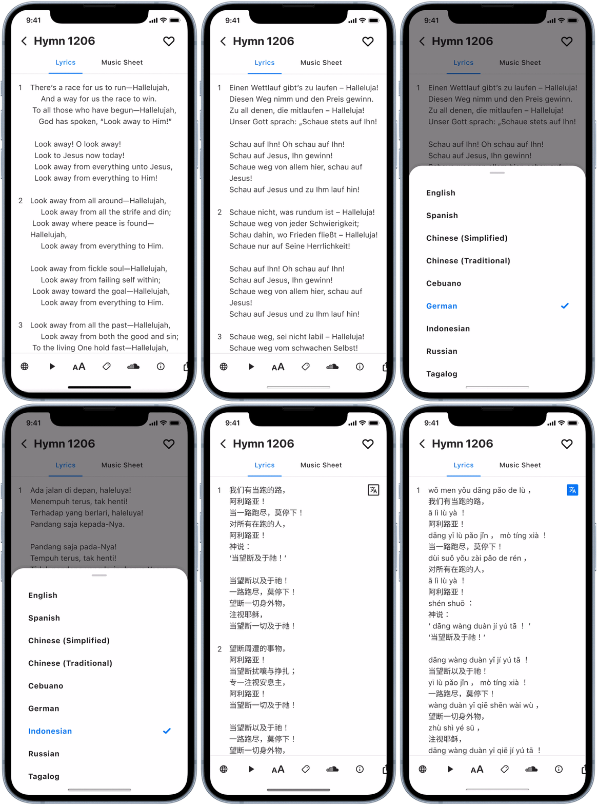
Language switching
This was crucial for our church community because we often come together and sing the same song in different languages. Now users are able to seamlessly switch between languages to follow along. We found many users giving positive feedback on this feature, and there have been requests to add more languages.
Adjusting font size
People often share their hymn books or phones with others around them during events. Allowing them to adjust the font size on the page makes it easier to share, and helps those who need a larger font size for clarity.
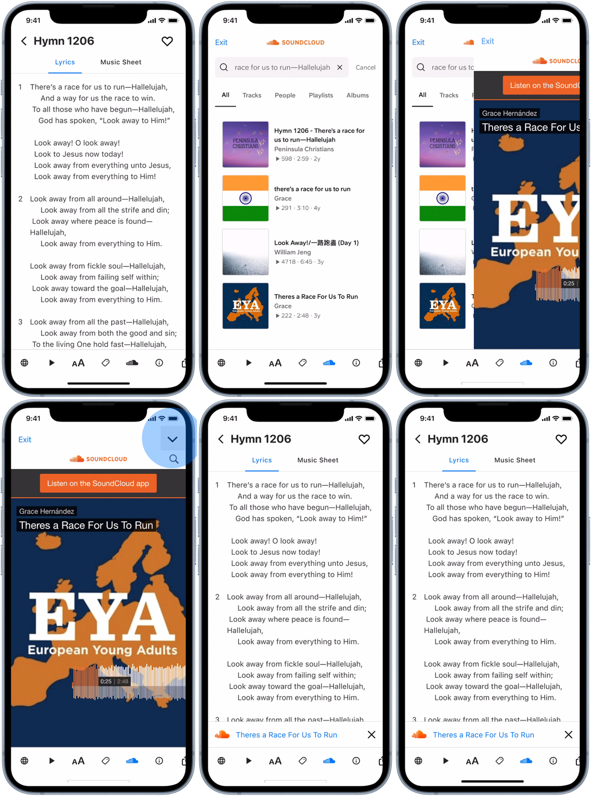
Soundcloud
One challenge our community has faced is learning new songs at events. Usually, you need more than one person who knows the song well to teach it to the rest of the group. However, there are many great recordings of hymns on Soundcloud that can be used to teach songs. Realizing this benefit, we integrated SoundCloud directly with the app to facilitate learning new songs.
Translating colors from light to dark mode
Light mode
Dark mode
Font size
Search
Music player
Turning custom icons in symbols
To prioritize design flows most of our icons are from material design which adjusts in weight and size based on the user’s phone settings. For icons that required custom designed, e.g. guitar sheet, I designed variations of size and weight. This kept our icons a11y compliant for users who didn’t keep their phone’s default font settings.
Adaptive icons for Android
These designs don’t just accommodate for the main app icon but also the app’s shortcut displays on Android
Original icon
Rounded Square
Teardrop
Square
Squircle
Circle
Empty states
Playful empty states to bring delight to our users and keep them engaged with the app


